 |

Too Kute...
I'm proud to say I had something to do with the development of the cutest thing to hit the internet since talking cats on YouTube, and that's the creation of Streetplay's Koncrete Kids (spelled with a "K"!)
They weren't always the Peanuts-like little darlings you see here to your right - that was the insightful genius of Streetplay's creator Mike Greene - to make them smaller and cuter. Originally I had imagined them somewhat older and more "street-like", perhaps even more unruly and borderline felons - but in hindsight I agree it was best to abandon that version. (Below, the very first drawing of the Koncrete Kids - a motley crew if I ever saw one!)
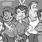
You will notice though, even while I made them look cuter during their renovations, I made sure they were still just "bad enough" to amuse me!
|
 |
 |

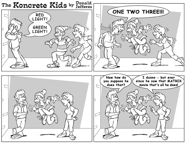
Above, the most current Koncrete Kids - and below, a slightly older rendition.
|
 |
|
|
 |
 |
 |
Funny Money
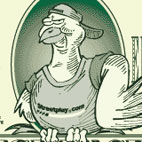
It became sort of a running gag that nobody who worked on Streetplay actually ever got paid - and contests run on the site had no monetary pay-off either. So in response to that tragic detail they decided to pay everyone with these, and I was asked to do the art. Try taking these to the bank! |
|
 |
|
|
|
|
Fun with balls
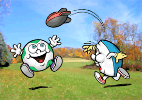
Another cartoon assignment I had more recently had to do with creating some quick ball characters for a company that manufacturers foam playball sets. Now balls, being mostly round or football shaped, don't lend themselves to a lot of expressive poses - so I just sort borrowed a page from those popular M&M characters you often see around and did something similar. The bright yellow and red football guy (called Ball Guy around the office) now appears on just about every printed piece associated with the company. He sort of became their Mickey Mouse!
By the way, no, I have no idea why that ball is eating burgers - why those balls up there are playing with another ball, or why this one is shaking pom poms... let's just move along, shall we?
|
 |
|
 |
Dog gone it...
This pup went through a few changes before eventually becoming the mascot for a ticket fighting site meant to serve the New York City area.
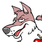
Honestly, I can't find the site anywhere - which leads me to believe the requestor either never got it off the ground or was advised that it would be a strong conflict of interests with his former law enforcement occupation. For whatever the reason I don't think our Police dog friend here ever found a home.
|
 |
 |
|
|
|
|
| Going Pazzo!
One of the longest, most involved graphic art endeavours I've ever taken on is without a doubt the work I've done for my brother-in-law's restaurant Toro Pazzo, which is Italian for "crazy bull." My work encompassed a website, newspaper adverts, business cards, menus, journal ads, banners, t-shirts, posters and signage - and it all started with the creation of this one pissed-off little bull.
|
 |
Several layouts were considered before settling on the final face, including a cute (yet undeniably goofy) embryonic version - which soon gave way to a series of expressions somewhat influenced by a bull you might remember seeing in a couple of old Warner Bros cartoons featuring Bugs Bunny. Naturally I changed him a bit to make him our own - but not before he went from punch drunk, to sneering, to snorting and downright angry.
Below is the finished restaurant logo, as well as a few of it's more notable applications!
|
 |
|
 |
|
|
 |
|
|

|
|
|
| I should also add a special thanks to my son, Craig, who did a fine job in helping me out with the inking of the final bull head on his tablet! Looks really nice, especially when sized up for some of the larger applications - like the outdoor signage and banners! |
 |
|
 |

